The 7 Elements of Art - Shape
What is Value in Art?
Value, one of the 7 Elements of Art, refers to the lightness or darkness of a color. It defines how much light a color reflects, or its position on a scale from black (the darkest value) to white (the lightest value), including all intermediate shades of gray.
Key Distinction: Value is independent of hue. Every color (red, blue, green) has its own value range. For example, yellow has an inherently high value (it is light), while purple has a low value (it is dark). You can have a light red (pink) and a dark red (burgundy) – it’s the same hue, but with different values.
Why is Value So Important?
Value is fundamental to visual perception. Of all the 7 Elements of Art, it is often considered the most important element. Even more so than color. Why? Because value directly affects how a piece of art is perceived, its mood, and the perception of the depicted world…
We perceive a piece where value was ignored and left ‘as it comes out of the tube’ (and thus unchanged) completely differently from a piece where care was taken to adjust the values to the needs of the artwork.

1. Defining Form and Volume (Modeling): This is value’s most important role. It is the tonal gradation (smooth transitions from light, through mid-tone, to shadow) that informs our brain that an object is three-dimensional. Without value variation, everything would look flat, like paper cutouts.
2. Creating the Illusion of Depth and Space: Areas with high value contrast (e.g., bright light next to dark shadow) appear to advance to the foreground. Areas with low contrast (e.g., gray next to a slightly darker gray) recede into the background. This is the basis of aerial perspective.
3. Establishing Composition and Guiding the Eye: Strong value contrasts immediately attract attention. An artist can use a light spot in a dark area (or vice versa) as a focal point to guide the viewer’s eye through the composition.
4. Controlling Mood and Atmosphere: The value palette has a huge impact on the mood of a piece:
High contrast (lots of black and white): dramatic, dynamic, powerful, unsettling.
Low contrast (narrow range of grays): subdued, subtle, melancholic, misty, calm.
5. Providing Structure (Regardless of Color): A painting with correctly distributed values will be clear and interesting even when completely desaturated (converted to grayscale). A painting that relies only on color often becomes a shapeless blob when desaturated.
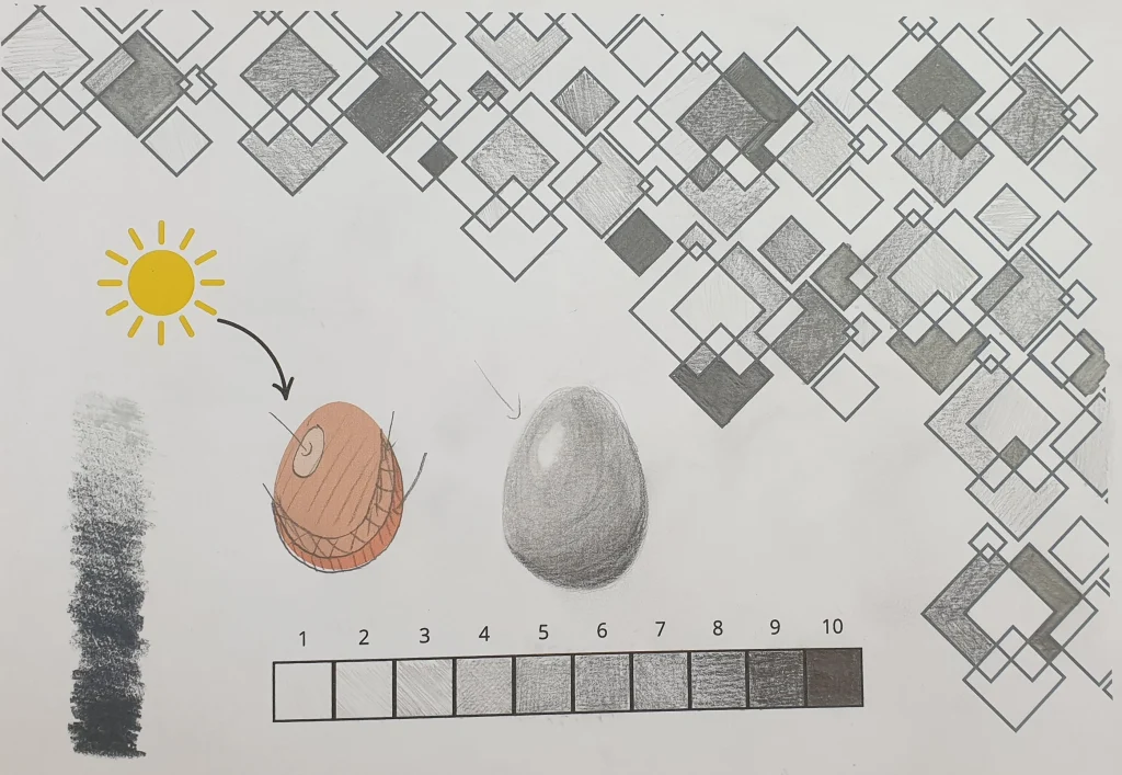
The Value Scale
Artists often use a value scale, typically from 1 to 9 or 10, where:
1 is pure white (the lightest possible value).
5-6 is middle gray.
9-10 is pure black (the darkest possible value).
Using the full value range (from the lightest lights to the darkest darks) gives a work visual power.
History and Evolution of the Approach to Value
Renaissance: Artists like Leonardo da Vinci masterfully perfected sfumato – a technique of soft, almost imperceptible modeling of form through delicate value transitions, giving their works an ethereal, gentle realism.
Baroque: Painters like Caravaggio and Rembrandt took chiaroscuro (clair-obscur) to the extreme. They used extreme value contrasts between deep shadows and bright, sharp lights to create intensely dramatic and emotional scenes.
Impressionism: Artists focused on light, but their value palette was often muted and of medium contrast, capturing the impression of shimmering daylight.
Film Noir and Photography: This film genre and photographic style directly inherited dramatic lighting and high value contrasts from the Baroque to build tension, mystery, and moral ambiguity.
Contemporary Art: Artists consciously manipulate value for abstract, expressive, or conceptual effects, often experimenting with its extremes.
Exercises for Practicing and Understanding Value
1. Desaturating Photos:
Take color reproductions of paintings or your own photos and convert them to grayscale (on your phone or in graphic software).
Analyze how the distribution of values creates form, depth, and composition. See which images remain clear and which lose their impact.
2. Value Drawing (Still Life with a Single Light Source):
Set up a simple object (an egg, a cup) and shine a lamp on it.
Draw its outline.
Using only a pencil (or one color of paint in different shades), fill in the shape, trying to render 5 distinct values:
1. Highlight: the brightest spot.
2. Light mid-tone: transition from the highlight to…
3. Terminator line: where the light ends and the shadow begins.
4. Cast shadow: the shadow the object casts onto the surface.
5. Form shadow (core shadow): the darkest part of the object, often with reflected light.
Goal: Draw not an “egg,” but the “form of an egg.”
3. Creating a Value Scale:
Draw a long rectangle and divide it into 9-10 squares.
Fill the first square with the lightest shade (almost white) and the last one with the darkest (almost black). Try to create smooth, even transitions between the squares. This is an exercise in precision and tool control.
Sometimes this exercise can be very difficult, so it’s also worth trying something else. On a sheet of paper, draw many different squares and fill them with random different pencil values to better understand the range of values. Or simply use my PDF.
Summary
In summary, value is the skeleton of a painting. It gives it structure, form, and drama. Mastering the conscious use of value – regardless of whether you work in color or in black and white – is absolutely crucial for creating convincing, deep, and emotionally moving works of art. Color attracts attention, but value gives it meaning.
No Responses