The 7 Elements of Art - Color
Among all 7 Elements of Art, color is the visual sensation that occurs in the brain when the eye receives light of a specific wavelength. In art, color is the pigment or light used to create visual sensations, mood, and meaning.
Physical Definition: Color is a light wave. White light (sunlight) contains all the colors of the rainbow, which we see when it is split by a prism.
Artistic Definition: Color is a fundamental tool of visual communication. Artists use it not to imitate reality, but to interpret it, build emotion, create harmony or dissonance, and guide the viewer’s eye.
Why is Color So Important?
Color has a powerful, often subconscious, impact on the perception of a work of art:
1. Conveying Emotion and Mood: This is its primary function. Colors carry strong psychological associations:
Warm (Reds, Oranges, Yellows): energy, passion, joy, aggression, danger, warmth.
Cool (Blues, Greens, Violets):calm, melancholy, sadness, spirituality, coldness, distance.
2. Creating a Focal Point: A bright, intense, or contrasting color immediately attracts attention, directing the eye to the most important element of the composition.
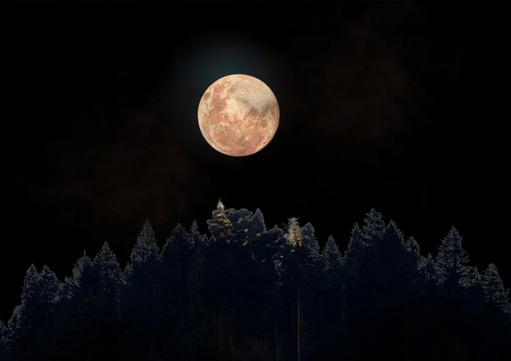
3. Creating Depth and Space: Warm colors appear to advance, while cool colors recede. An artist can use this phenomenon (aerial perspective) to suggest depth without using linear perspective.
4. Building Symbolism and Meaning: Colors have deep cultural and historical significance.
Red: love, blood, power, revolution, sin.
Blue: infinity, divinity, fidelity, sadness.
Gold: divinity, royalty, light, immortality (common in icons).
5. Defining Form and Light: Through changes in a color’s hue and saturation, an artist can model the form of an object, showing where light and shadows fall.
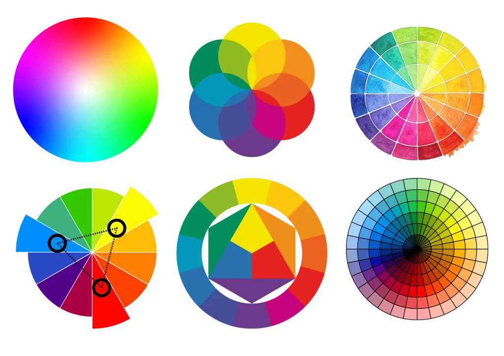
Key Concepts and Terminology (Color Wheel)
To understand color, one must know the basic terms that describe its properties:
Color Wheel: A circular diagram that shows the relationships between colors, noting that there are many different color wheels from different times, eras, and artists.
It consists of:
Primary Colors: Red, yellow, blue. They cannot be created by mixing other colors.
Secondary Colors: Created by mixing two primary colors (orange = red + yellow, green = yellow + blue, violet = red + blue).
Tertiary Colors: Created by mixing a primary color with an adjacent secondary color (e.g., vermilion = red + orange).
Hue: This is the “pure” color, its name (e.g., red, blue, green). It refers to its position on the color wheel.
Saturation: The intensity or purity of a color. A color with high saturation is vibrant and bright. A color with low saturation is muted, dull, and closer to gray.
Value: The lightness or darkness of a color. It determines how much white or black is mixed in. Yellow has a high value (is light), violet has a low value (is dark). You can have the same hue in different values (e.g., light pink and dark burgundy).
Key Color Combinations (Color Harmonies)
Artists consciously combine colors to achieve a desired effect:
1. Complementary Colors: Lie opposite each other on the color wheel (e.g., red-green, blue-orange, yellow-violet). They create maximum contrast and vibrating energy. Used cautiously to avoid distraction, or deliberately to grab attention.
2. Analogous Colors: Sit next to each other on the color wheel (e.g., yellow, yellow-green, green). They create harmonious, calm combinations, often found in nature.
3. Monochromatic Colors: Different shades, tints, and tones of a single hue (e.g., dark blue, blue, light blue). They create a very unified and cohesive impression.
4. Triadic Colors: Three colors evenly spaced on the color wheel (e.g., red, yellow, blue). They are vibrant and balanced, even when using saturated pigments.
History and Evolution of the Approach to Color
Prehistory and Antiquity: Use of natural pigments (earth, chalk, ochre, powdered minerals). Colors often had symbolic meaning (red = life, black = death).
Renaissance: A limited palette, dominated by earthy pigments (umber, sienna), red, and lapis lazuli blue (very expensive). Color was subordinate to drawing and served mainly to model form.
Baroque: Artists like Caravaggio and Rembrandt used color to build dramatic chiaroscuro, often limiting bright, saturated hues to small, key areas.
Impressionism (19th Century): REVOLUTION! Artists (Monet, Renoir) rejected mixing pigments on the palette. They applied pure, saturated colors side by side so they would mix in the viewer’s eye. They studied how color changes under different lighting conditions.
Expressionism and Fauvism (Early 20th Century): Color liberated from the duty of imitating reality. Artists like Matisse (a Fauvist) and Kirchner (an Expressionist) used bright, unnaturalistic colors solely for emotional expression. “Color exists for its own sake” – Matisse.
Abstraction and Pop-Art (20th Century): Mark Rothko explored the mystical power of large color fields. Andy Warhol used loud, commercial color combinations from mass culture.
Contemporary Art: Artists have access to an infinite palette, including fluorescent colors, neons, and digital light (RGB). They experiment with color perception and its interaction with the viewer.
Exercises for Practicing and Understanding Color
1. Value Study in Color:
Choose one object (e.g., a red pepper, a green apple).
Draw and paint it using only one hue (e.g., only reds). To shade or add texture, use that same color but in a different shade or saturation.
This trains sensitivity to value in color; you can also use different materials.
For example, mix markers with crayons and pastels, or stick to just one technique.
2. Analogous Harmony:
Choose three neighboring colors on the wheel (e.g., yellow, yellow-green, green).
Create a small abstract composition using only these colors and their shades. Observe how harmoniously they interact. Try alternately adding and removing color to understand how they influence each other and how the dominance of one over the others works.
3. Focal Point Through Contrast:
Paint a simple landscape or still life in a subdued, cool color scheme (e.g., various blues and greens).
Then add one, small element in a bright, warm complementary color (e.g., an orange boat on blue water). See how it immediately draws attention.
4. Master Copy:
Find a reproduction of a painting by a recognized colorist (e.g., Van Gogh, Matisse, Monet).
Try to copy it, not so much by faithfully reproducing the shapes, but by trying to recreate the colors and their relationships as accurately as possible. This is the best lesson in color mixing and seeing their subtleties.
Your work might also simply resemble many different colored..
Summary
In conclusion, among all 7 Elements of Art, color is power. It is not just decoration, but the heart of art’s emotional and symbolic language. Using it consciously allows one not only to see but to feel the artwork. It allows for conveying emotions and sensations to other people.
No Responses