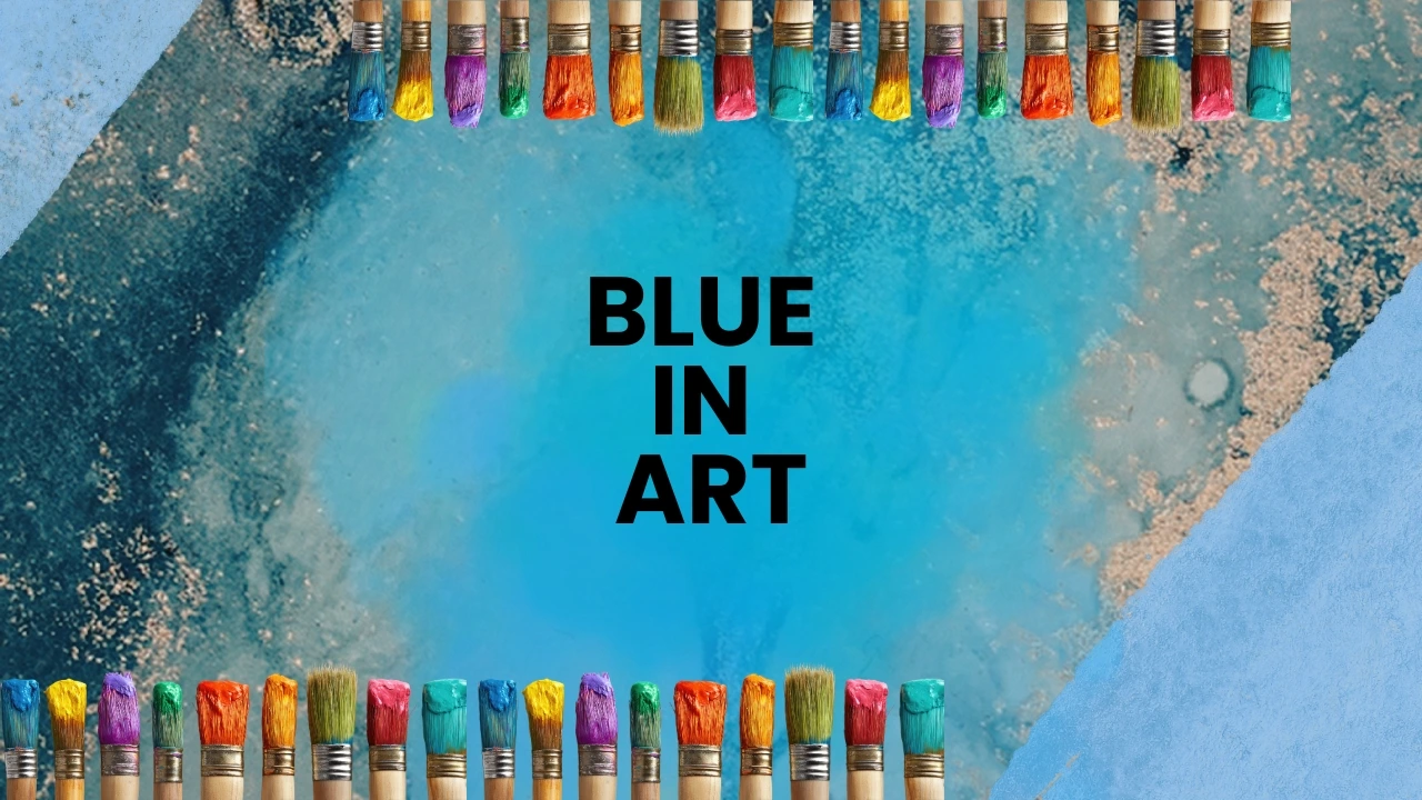
Hello everyone, today we’re going to talk about the color blue in art.
What is its impact, what should you use it for, what is its emotional quality, and how does it affect the perception of art?
In this blog:
- Blue – an exclusive and rare color
- History of blue in art – from antiquity to the present day
- Feelings and symbolism of blue
- The influence of blue on the viewer and the artist
- Fun facts!
- Why do we love blue?
- A few final words
1. Blue – an exclusive and rare color
Why was blue one of the last colors that humanity learned to produce?
Unlike red (ochre, iron oxides), yellow (clays, sulfur), or black (charcoal, burnt bones), natural, durable blue pigments practically do not occur in an accessible form:
- Plants – they mainly yield yellows, greens, and browns. Blue in plants is rare (e.g., indigo, bellflower). Moreover, most blue plant pigments are unstable, they fade under light exposure.
- Animals – the murex snail produces purple (red/purple), but blue – none.
- Minerals – this is the key: for millennia, the only source of intense, lightfast blue was:
Lapis lazuli – mined in only one place on Earth (the Badakhshan mountains in present-day Afghanistan). Extremely rare and expensive.
Azurite – somewhat more common, but it crumbles, darkens over time, and is difficult to grind.
Chrysocolla – yields a rather greenish blue, not very intense.
For over 4,000 years, humanity had access to red, yellow, brown, black, and white, but blue was either an extremely rare luxury (lapis lazuli) or a technological puzzle of lost knowledge (Egyptian blue). The sky was within reach, but capturing its color in a durable pigment proved to be one of the greatest challenges in the history of chemistry. It was only the Industrial Revolution that made blue cease to be the color of gods and kings – and become the color of everyone.
2. History of blue in art – from antiquity to the present day
Antiquity
Egypt: the first synthetic pigment – Egyptian blue (frit), symbolized the sky, water, and creation.
Greece and Rome: blue used less often (costly), more frequently in wall painting (e.g., Pompeii).
The Middle Ages
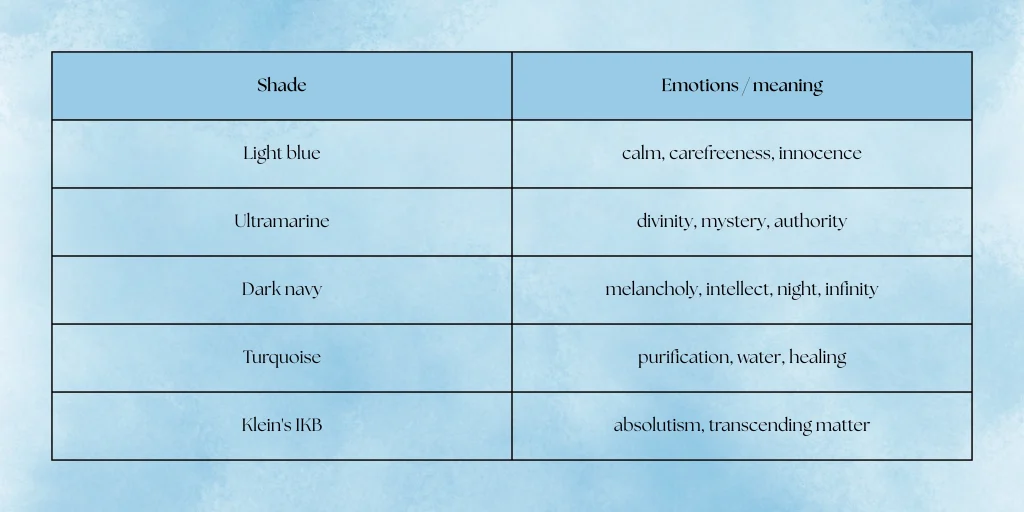
Ultramarine from lapis lazuli – more expensive than gold. Reserved for the cloak of Mary and Christ in religious painting.
Symbolism: divinity, heavenly quality, spiritual purity.
The Renaissance
Use of blue as a sign of the commission’s prestige (e.g., Titian, Giotto, Raphael).
The Golden Age of ultramarine – clauses in contracts stipulating that “Mary must be painted in ultramarine.”
Baroque and Classicism
Blue as the color of emotion – Vermeer (The Milkmaid, The Letter), use of natural ultramarine in light.
Landscapes – the sky becomes a subject in its own right (e.g., Poussin, Lorrain).
The 19th century – the industrial and emotional revolution
1824 – invention of Prussian blue (cheaper, more intense).
1826 – synthetic ultramarine (available to everyone).
Romanticism: blue as an expression of longing, infinity, melancholy (Caspar David Friedrich).
Impressionists: Monet, Renoir – blue as the color of light and shadow (“Rouen Cathedral Series,” “Water Lilies”).
The 20th and 21st centuries
Picasso – The Blue Period (sadness, poverty, alienation).
Yves Klein – International Klein Blue (IKB) – color as spirituality and void.
Minimalism and abstraction (e.g., Rothko, Ad Reinhardt – black and blue as meditation).
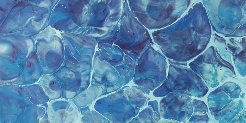
3. Feelings and symbolism of blue
Psychologically: blue lowers blood pressure, calms, aids concentration.
In Western culture: the color of law, science, logic (blue suits, tech company logos).
4. The influence of blue on the viewer and the artist
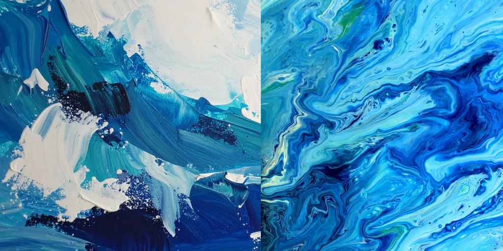
Spatial effect – blue recedes (unlike red).
There’s a scientific reason horizons feel so far away: atmospheric perspective. As light travels through the atmosphere, shorter blue wavelengths scatter, pushing everything into a cool, distant haze. In design terms, blue is a recessive color. It shrinks space and retreats from the eye, while red jumps forward and demands immediate attention. This is why a small room painted pale blue feels more expansive, and why blue text on a website feels less “urgent” than red.
In composition: often in the background or as a dominant element creating mood.
Painters and photographers exploit this recession constantly. A blue backdrop is the silent workhorse of visual art—it frames the action without stealing the spotlight. When blue does take over the whole frame (a big, empty sky or a monochromatic deep blue canvas), it stops being just a backdrop and becomes the subject of introspection. It’s the difference between looking at a person and feeling the weight of the ocean around them.
Art therapy: used in works for people with anxiety or trauma.
In art therapy sessions, blue materials—cool clay, pastel chalk, or deep watercolor—are often placed within easy reach of clients processing hyperarousal or panic. It’s a visual and tactile sedative. Creating with blue isn’t about expressing sadness; it’s about lowering the volume of the nervous system. It allows the brain to find a baseline of safety where words might fail, which is why so many “calm” coloring books for adults lean heavily on the blue-green spectrum.
In film and photography: cool-toned films (“Amélie,” “Blade Runner”) create distance or sadness.
The colorist’s hand is never heavier than when they shift the white balance toward cyan or teal. In Amélie, the green-blue wash is nostalgic but slightly isolating—it puts a pane of glass between the viewer and the quirky world of Montmartre. In Blade Runner 2049, the oppressive blue-grey isn’t just rain; it’s the emotional climate of a future where connection has short-circuited. A cool-toned film doesn’t just look cold; it makes us feel separate from the warmth of the characters.
5. Fun facts!
- Ancient Egyptian blue glows in infrared light.
- Ultramarine was worth more than gold (literally).
Before the 19th century, the most vibrant blue came from grinding lapis lazuli stones mined in a single mountain range in Afghanistan. The process was so labor-intensive that the pigment was more expensive than gold leaf. Artists didn’t own the paint; wealthy patrons bought the pigment and handed it out in rations. That’s why you rarely see it wasted on peasants’ robes—only the Virgin Mary’s cloak. - Japanese indigo blue (aizuri-e) – Hokusai and “The Great Wave” – symbol of the elements and control.
- Picasso’s “Blue Period” was triggered by a specific tragedy.
Everyone knows the moody, monochrome paintings from 1901–1904, but the switch wasn’t purely aesthetic. It was a direct reaction to the suicide of his close friend, Carles Casagemas. Picasso later admitted: “I started painting in blue when I learned of Casagemas’s death.” The color wasn’t just a style choice; it was a prolonged state of mourning made visible. - In the Middle Ages, blue was considered “the color most worthy of God” – it was also used for secular portraits only with special permission.
- Yves Klein invented his own shade and then patented the emptiness.
In 1960, the French artist didn’t just mix a blue; he created a chemical binder (Rhodopas M) that allowed the pigment to keep its “powdery velvet” texture without dulling. He called it International Klein Blue (IKB). He then famously exhibited nothing but empty white walls (with a blue cocktail at the opening) and claimed the space itself was saturated with the color’s presence. - Giotto in the Scrovegni Chapel – the ceiling with a “starry” sky in ultramarine.
- Vermeer bankrupt his household buying Natural Ultramarine.
The Dutch master was so obsessed with the light-catching quality of genuine lapis lazuli that he used it for a humble maid’s headscarf (Girl with a Pearl Earring) and even a milkmaid’s apron. After his death, his widow had to sell paintings for bread money, yet his palette was littered with the 17th-century equivalent of a luxury sports car. The financial ruin is baked right into that glowing blue.
6. Why do we love blue?
Because it is everywhere in nature, yet difficult to capture. It’s the sky we can’t touch and the deep sea we can’t breathe. Ancient artisans spent centuries trying to trap it in stone and glass.
- It is the color of thought, dreams, and infinity.
- It asks nothing of us but patience.
- It doesn’t scream for attention like red or demand energy like yellow,
- it just waits for us to settle into it.
It combines technique (pigment chemistry) and metaphysics (spirituality). From Egyptian faience to Yves Klein’s patented binder, blue is the bridge between the laboratory and the chapel.
And deep down, in the part of the brain that still trades shells for silk, blue evokes luxury and knowledge. To wear it or paint with it was once an act of reverence and wealth. That ancient whisper of value never left us it just went quiet, humming beneath every pair of jeans and every pixel of a clear sky.
7. A few final words
Blue has been a color that has long intrigued people, reaching beyond standard perceptions and understandings of associations. It not only reminds us of the sky or water but also of science, sadness, and calm. Understanding its history and impact will help us create better works, filled with the meaning and emotions we wish to express.
And you? Do you have a favorite use for the color blue? Or perhaps you already have an idea for creating a composition with blue?